Ever since Google announced that Core Web Vitals would be incorporated into their ranking algorithm, developers everywhere are sweating coffee trying to find ways to improve those notoriously difficult metrics.
I’m definitely not an exception. While working on a recent website launch, I took on the challenge of trying to get these metrics into Google’s “Good” rating. But this is a feat that’s significantly easier said than done - especially if you’re working with a CMS like WordPress, and even moreso if you’re using a page builder to build the site.
Before diving into this article, a quick intro into me. I am the founder of Propel and I've been a developer for over 15 years. Our agency specializes in search engine optimization as well as highly functional and performant website design & development.
Of all of the metrics that make up Core Web Vitals, Largest Contentful Paint (LCP) was one metric that was much different to optimize for than the others. Where as the other metrics tend to be very tightly tied to general website and server performance, that wasn’t completely the case with LCP.
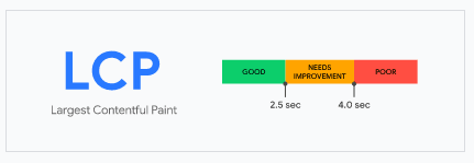
LCP is a bit different in that although it is tied to website and server performance, it’s also impacted by the design of the above the fold content. Our standard performance optimization process fell short of the mark with LCP, despite getting “Good” ratings on the remaining Core Web Vitals metrics.
To troubleshoot LCP, I looked at the Web.dev reports and also analyzed the site by looking at Lighthouse reports in the browser using Chrome dev tools. What I found was that the culprit for the higher LCP value was a large hero image. Because the hero image was the largest element in the viewport, the delay in loading that hero image caused the LCP value to increase.

I tried a number of things including cropping, resizing, and compressing an image specifically just for mobile. I also tried preloading the image. Both of those strategies helped, but failed to really reduce the LCP value much.
Now with images that are below the fold, you can always rely on lazy loading those images to improve your performance. But what lazy loading means is that you’re essentially not loading something until it comes into the viewport. The problem here is that the large hero image is always going to be in the viewport, so be definition it can’t be lazy loaded, so we can’t rely on that method.
After a short recess, I had a creative out-of-the-box solution that I thought might work. We use WP Rocket as part of our performance toolkit, and there was a feature of WP Rocket that I thought I might be able to hack to manipulate the loading sequence in my favor.
The trick I wanted to try out involved taking advantage of a WP Rocket feature called Delay JavaScript Execution. This feature delays the execution of JavaScript code until a user interacts with the page by scrolling, hovering, or clicking on the page.

I wrote a single line of JavaScript code that would simply add a class to the HTML element which I could use to defer the loading of elements, like the hero image:
document.getElementsByTagName('html')[0].classList.add('js-user-action');
The next step was to remove the background from the hero, and only load it when the .js-user-action class was present on the HTML element - after the user interacts with the page.
    html.js-user-action .hero{
    	background-image: url(‘my-background-image.jpg’);
	}
We still need to do one more thing. Since the background image won’t load until the user interacts with the page, a fallback needs to be added for the hero. In my scenario, I added a background color or gradient that matched the site’s design and color palette.
    .hero{
    	background: linear-gradient(140deg, #004990e6, #00499057)
	}

This worked exactly how I expected, and because Page Speed Insights and other performance benchmarking tools don’t register user interactions, our LCP finally crossed the threshold to green - going from 3.2s to 2.5s.
Although this accomplishes the goal, it’s not without a cost. The background image will not load until the user interacts with the screen, so something needs to be used as a fallback until the image can be loaded. I asked a few friends to load the page on their phones and tell me if they found anything strange about the page, and none of them noticed anything “off”. What I observed is that the few friends I asked to test this all had their fingers on the screen or quickly touched the screen when the page was loading, so it happened so quickly they didn’t notice. I think most people browses the internet the same way on smartphones, so I actually don’t mind this implementation - but I can see how some might not prefer it.
Although this implementation works at accomplishing the goal of improving LCP, some might not be too happy at the idea of a “lazy loaded” hero image. I wanted to find a possible solution that could be a compromise between additional performance and more design cohesiveness.
What I did was create a mobile sized image for the hero, and applied a small guassian blur with Photoshop. The guassian blur creates more pixels that are similar to eachother, which reduces the filesize. The file can also be saved with a much lower quality level which further reduces the size. Because there are more similar or like-pixels, compression tools like Short Pixel are able to compress the image more which further reduces the filesize.
The last step was to add the blurred image to the hero as the starting image, and then “lazy-load” the full resolution image on user interaction - creating an effect of the picture coming into focus. The net result is an implementation which respects the original design more, but still lowers the LCP because the hero image is very small.
One improvement to this trick that I felt was necessary, was to only implement this deferred loading on mobile devices. After all, Core Web Vitals are actually quite easy to meet on desktop computers with unthrottled, cable/dsl connections.
The problem with hacking the WP Rocket feature is that WP Rocket doesn’t distinguish between desktop and mobile, and will create the same deferred loading on both device types.
After searching online and finding some Stack Overflow JS snippets I could combine or customize, I was able to recreate the WP Rocket feature and tailor it so that it only uses this deferred loading for mobile devices:
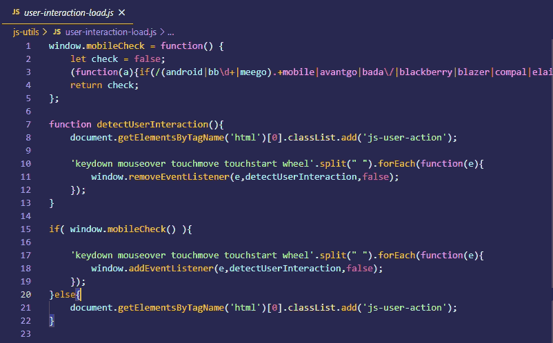
Stack Overflow Snippets
Detect Mobile Device: https://stackoverflow.com/questions/11381673/detecting-a-mobile-browser
This code can be reduced further if we leverage JavaScript Media Queries.
It would also be much better if we could selectively implement this type of progressively enhanced loading, based on the user’s network connection using the Network Information API. Unfortunately, at the time of writing this article, browser support for the Network Information API is poor so we would need to wait until there is more browser support behind that feature before we could consider using it.
There are other ways to improve LCP that are more conventional, and arguably more acceptable, however I like the idea of knowing there is always an ace up my sleeve that I can pull if the need arises.